TrueDelta has perhaps been a bit heavy on numbers. Aside from being pretty to look at, charts and graphs can effectively convey more information at a glance than a page full of stats can. So we’ve been adding these to our key pages.
We now have charts or graphs on the repair-odds pages, car problem description pages, and real-world fuel economy pages.
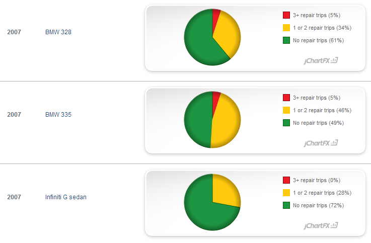 Our “nada odds” and “lemon odds” stats provide the car reliability information many car buyers are seeking, yet get far less attention than our more conventional “repair trips per 100 cars” stats. These charts, which illustrate the percentage of cars that have required no repairs in the past year and the percentage that have required three or more repair trips, should help. Bar charts are also available.
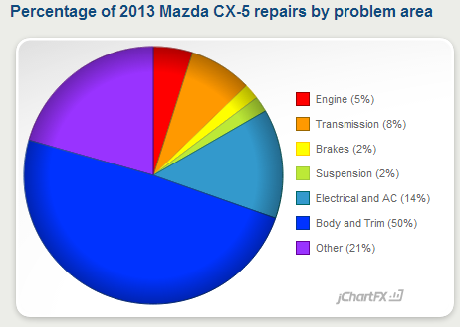
 We originally added TrueDelta’s car problem description pages so people could see the specific problems behind the numbers in our reliability stats. But they’ve become the most visited pages on the site!
With so much text these pages can be overwhelming. So Gayla added a new pie chart displaying the percentage of repairs by problem area, for a quick, colorful snapshot.
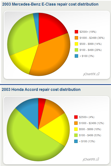
More recently, Gayla added pie charts of repair trip costs to the car problem descriptions pages. After all, it’s not just the number of repair trips. It’s also how much each one hurts. In this particular comparison, the Mercedes hurts far more than the Honda.
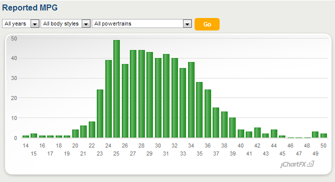 We’ve also added bar charts to the real-world fuel economy pages.
These are just the start. Have another chart or graph you’d like to see? Send us a suggestion!