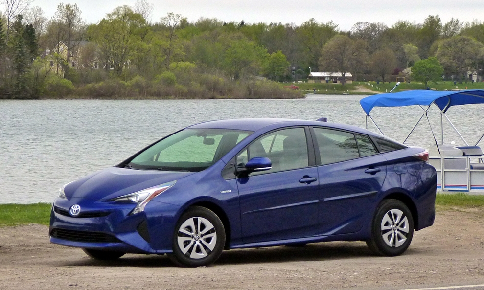
Judging from Toyota’s cars, design has been an afterthought at the world’s largest auto maker, something tacked onto whatever the engineers came up with. Even when the company decided to place more emphasis on design, this meant adding more extraneous details to a shape that was largely beyond the designers’ control. As a result, the cars appeared neither coherent nor attractive. Often they appeared odd. This tendency might have peaked with the current Prius.
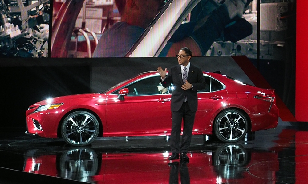
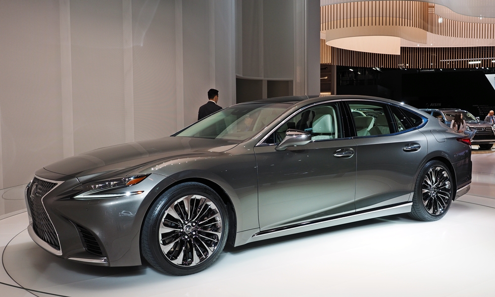
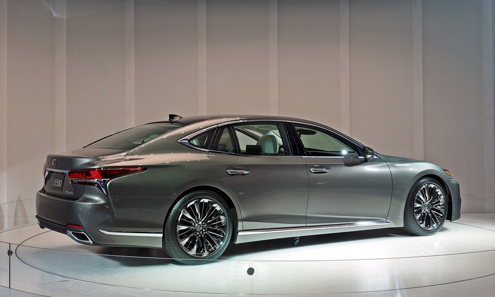
My father helped me cover the Detroit auto show (NAIAS) this year. He was especially impressed by Akio Toyoda’s presentation of the new 2018 Toyota Camry. And if the current Lexus LS looked like the new 2018, he might have bought it instead of the Tesla he’s now driving. We both thought that, with these two cars, Toyota’s and Lexus’s design had finally turned a corner. At the show both struck us as much more refined, integrated, and attractive than their predecessors.
But auto show presentations have a way of generated undue enthusiasm. Otherwise, what’s the point of giving them? Now that a month has passed, how well do the new designs hold up? Are they a big step forward for their brands?
In the case of Lexus, probably so. The new LS appears a little bulbous from some angles–the roof arcs quite high–but it goes well bound any previous LS in making a distinctive design statement, and making it well.
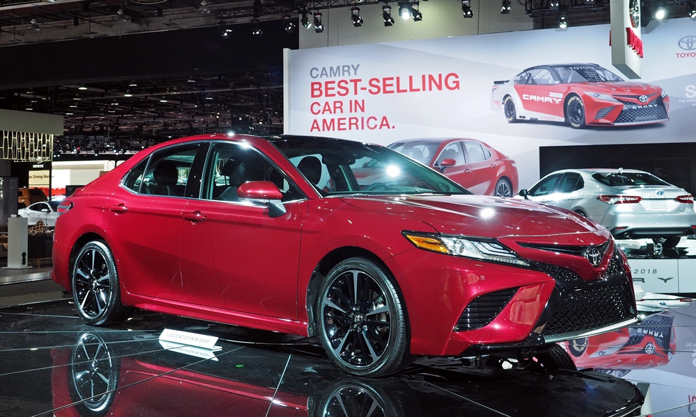
In the case of the Camry, I’m less sure. I’m seeing quite a bit of Honda Accord in the new car, with perhaps a dash of Acura TL.
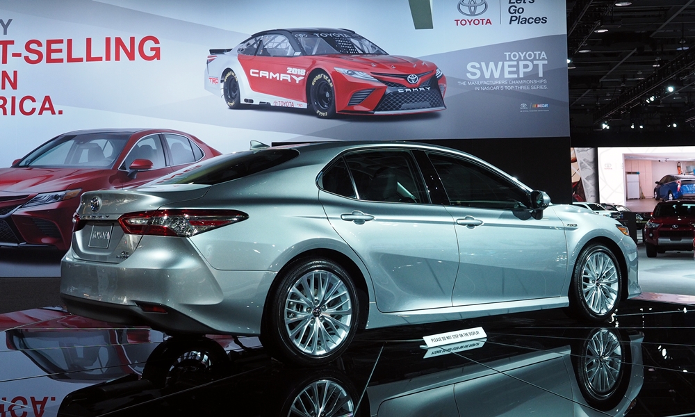
In other words, aside from the overdone front end it’s a fairly well executed but unexciting design that once out of the road will blend in. It’s about where the 2007 Camry was in 2007: a big improvement over its predecessor, but not a car that many people will buy because they love how it looks.
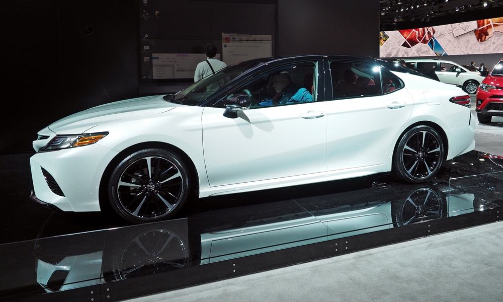
That said, I do like the large windows, the practically positioned windshield, and how the base of the windshield lines up with the base of the side windows. The area around the front pillar has been designed very well. The rib along the upper body also works well. I’m less a fan of the character line through the rear pillar, which enables this optional two-tone treatment:
What are your reactions?